
Storm of Light
Working Week
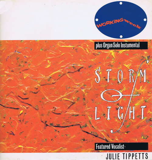

title: Storm of Light
artiste/band: Working Week
record label: Paladin (Virgin)
format: 7" & 12" single
release date: 1984
misc:
brief / approach
I drew a reclining nude figure, cut it out of speckledy, textured cardboard and stuck it on to another piece of cardboard and 'built up' some more features like a contour map...
The acrylic paint (mixed with PVA medium to make it extremely translucent) was applied with a very small palette knife in lots of small smears & dabs. It's meant to be a cross between fire & water - a Storm of Light.
A final top coat of transparent medium was applied but with a tiny bit of Cadmium Yellow added to keep it bright...
The 'clock face' logo shows a different time on every release... I also made a version of the logo as real clock intended for PR to record shops.
The lettering was, as usual, hand drawn - this was to keep things visually distinctive and partly so that nobody could rip off any of my 'typefaces'..!
backstory
After Stiff there were only a handful of bands/artistes that I got to work with designing their 'graphic look' & logo (ans subsequent promo & poster campaigns) from their begining through a series of single releases to their 2nd or 3rd album - Working Week were the best example of this and from the outset their style continues a design nod to New York 'Blue Note' records of the late 40s and 50s...
incidentally the other post-Stiff bands who I did a long run with and appear on this 'site were Theatre of Hate/Spear of Destiny and Ledernaken, The Sinatras & John Otway for the infatiguable Maurice Bacon's Strike Back Records...