
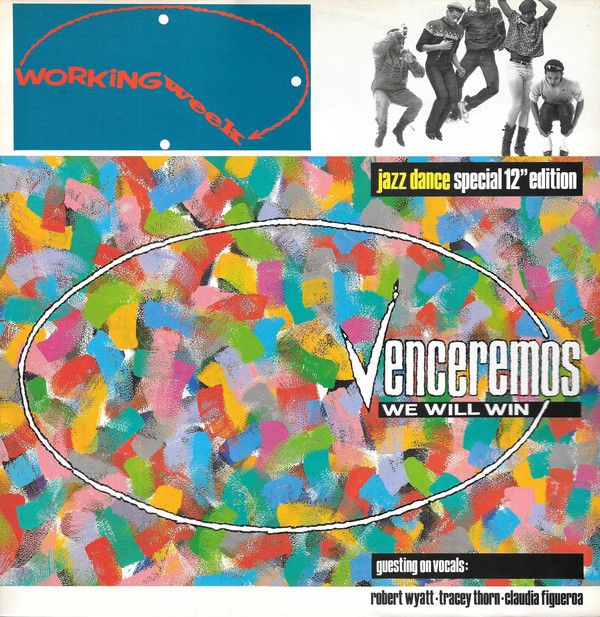
Venceremos (We Will Win)
Working Week
title: Venceremos (We Will Win)
artiste/band: Working Week
record label: Paladin (Virgin)
format: 7" & 12" single
release date: 1984
misc:
brief / approach
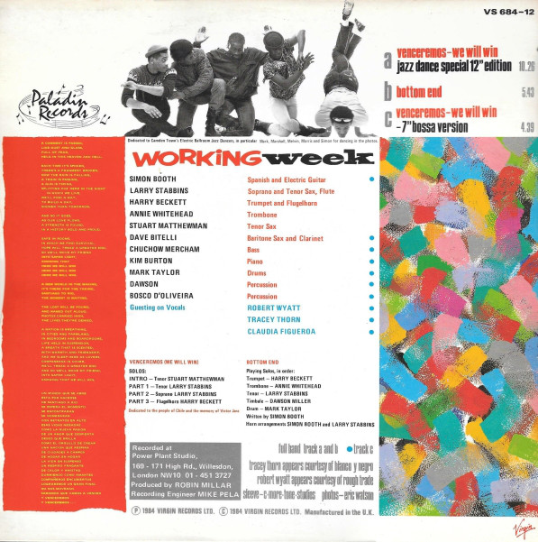
Working Week were the first Jazz Dance band (a very popular genre in London for a couple of years). I was given carte blanche to create their 'identity', my favourite thing to do. The style (which was carried through a number of releases) is a nod to the old Blue Note jazz label of New York, with a wide white band at the top, a narrower one at the bottom, a compact font, and very tightly cropped black and white photography.
The hand-drawn logo shows a different time of day on every release, sometimes a significant one of the working day.
The painted section of the front is flat brush daubs on 'canvas' textured art board. The back is a template of columns, with lots going on visually that was used for various matching back cover laouts
The label is a halftone of part of the cover, printed in a different colour...
backstory
I usually made artwork 12" square as there weren't many flatbed scanners that went bigger than that - the relatively new rotary scanners were an issue - fine for transparencies & paper but sometimes the operators would peel the artwork card to split it in half (in layers) to get it to bend onto the drum - and unfortunately I had a handful of painted/collaged artworks fucked up back then - rotary scanners have become ubiqutous since then...