
Let's be Frank
The Sinatras
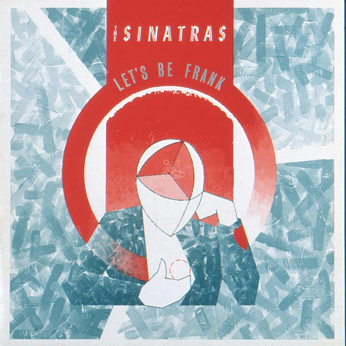
title: Let's be Frank
artiste/band: The Sinatras
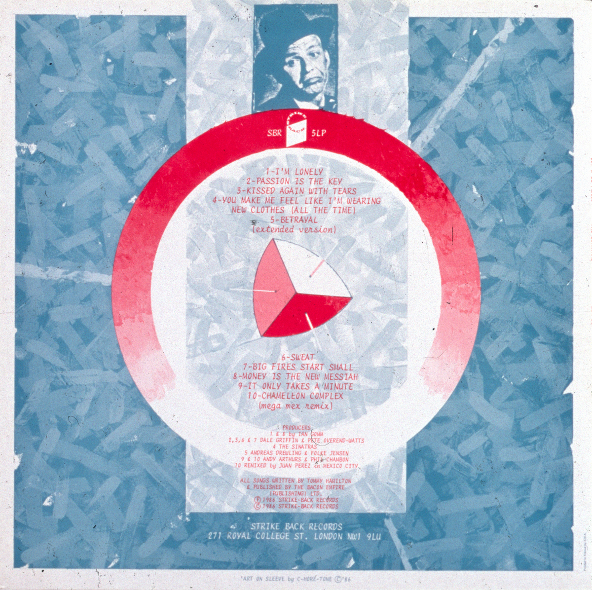
record label: Strike Back Records
format: 12" LP
release date: 1986
misc:
brief / approach
Artwork for a record cover is very much like an engineering drawing, you assemble it, or give instructions how to do so. It's a completely different thing from Art, it's a totally technical process... You have to artistically anticipate the physical assemblage - making artwork has always fascinated me, it's just such a truly magic trick..!
On this one I knew all along what effect I wanted... It's trying to do the same as with comics, doing your own colour separations (which is also a magical process) but doing it in a painterly way instead of graphically... So the artwork's brushstrokes are all of various tones of grey - that you then turn into the halftone screen dots (like old B&W newspaper pics...) that will make the painting 'printable' - and then the chosen colour(s) of ink will be specified - two in this case - to complete the transformation from original painting to technical 'separated' artwork to a printed cover...
There are nine tones of grey but no black outlines. My favourite Pantone colour was/is Red 023 - which goes greta with turquoise...
Hand drawn lettering again, and the text on the back cover is a 'golfball' font from an early electric typewriter...
Also, I had to be careful with the image of 'Frank'... I altered it slightly to avoid any 'issues'...
backstory
I did all the Strike Back Records covers for three or four years - I had complete carte blanche for everything I did for them - for Ledernacken & John Oyway as well - and that was a designer's dream for me, as the results were a culmination of all the processes that that I'd developed before and much better for the trust given to me in the first place...
Strike Back Records was owned & run by the Love Affair's drummer Maurice Bacon - he was also John Otway's manager when he signed him to Stiff...